Niall O'Loughlin examines this recent trend in logo design and looks at some noteworthy examples.
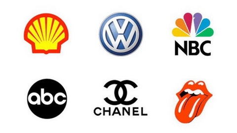
It is becoming increasingly popular for brands to change their logo design in order to move with the times. Complex logos are but a distant memory as organisations look for simple designs that are clean cut and memorable while still defining their brand.
During the first few months of 2015, we've yet again seen logo changes aplenty and the vast majority of redesigns have seen the logos in question become more simplified. Here, we look at seven significant logos that have undergone a makeover in 2015...
01. Integrated research

IR is an Australian company known to be a global leader in proactive performance management software and it has really embraced the idea of simplicity in its new design. The original logo featured a green monogram with the company's name in tight Museo typeset beside it.
The new and improved logo is simple in the extraction of the initials to their absolute minimum and the result is a confident and contemporary look.
It's a great example of minimalism while still using three colours and unlike the old logo, it looks good whether it is placed on a giant billboard or on stationery.
02. Royal Albert Hall

The famous London performing arts centre has had a recent communications overhaul in a bid to appeal to a wider audience and a logo change is part of its new look.
The institution is working with strategy consultancy firm BrandPie's charity arm and the purpose of the new logo is to emphasis the centre's reputation as a world class venue.
The Hall's distinctive silhouette is featured on the logo which is designed for use across different media. Unlike recent logo changes however, it is arguable as to whether the new creation has a simpler design than the old one. While the new logo looks smaller and cleaner, it has five colours (against two) and is a more complex silhouette.
03. Toronto Raptors

The NBA franchise's logo was unveiled late last year to mixed receptions as the older more detailed logo has been replaced by a fairly basic design enclosed within a circle.
It comes hot on the heels of a logo change by NBA rival the Brooklyn Nets. The logo is part of a larger rebranding effort, which also includes a 'We Are The North' campaign.
04. Banco Popular

This organisation is one of the biggest bank groups in Spain and its new logo really pushes the boundaries of simplicity. The name 'Banco' has been completely removed from the original logo which now just features the name 'Popular'; the logo uses both serifs and a second case has been added.
A slanted line is often placed beneath the logo with taglines such as 'Con Paso Firme' (Firmly forward) used in advertising. The slanted line is an excellent visual device which allows the logo to stand out against any background.
05. Verifone

Lord knows what those angular, beveled shapes on the old VeriFone logo were supposed to represent. A folded bank note? It looks like they finally realized that they had no idea, either, and chucked the whole thing in favour of a safe but effective colour highlight.
06. Open Table

OpenTable ditched both three dimensionality and linear perspective with its new logo, instead pushing a perfectly circular mark flat against the plane of the screen.
The new logo sets out to, in just a few shapes, symbolise the connection open table forges with resturaunts and diners and to highlight the fact that they exist to help diners find that “perfect fit”.
07. Daily Motion

Launched in 2005 from the living room in Paris of one of its partners, Dailymotion is one of the bigger video platforms behind YouTube, boasting 300 million viewers on its player and 30 billion video views worldwide per month.
This year, Dailymotion introduced a new logo which says goodbye to its icon, opting instead for a simple wordmark logo. We're sure the kerning took ages to get exactly right, but still, at the end of the day this is a pretty radical simplification.

