Whether we consciously think about it or not, color is information. Text, images, and animations all fall into the category of “content” when found in online environments – but what about color?

Just as with print designs, such as those for booklet printing or business cards, web designs use color to create hierarchy, draw the eye, and add texture. However, knowing a bit of color theory will help you to more powerfully incorporate color into online projects. Below, the brief overview of online color theory should give you some new knowledge to apply when choosing colors in web design.
Basics: Color Wheel Theory
As a designer, it is necessary to be familiar with at least the basic attributes of visible light – or color. There is quite of bit of information in this realm of art. There are even college courses dedicated to the study of color and its features. For now, however, let’s focus on hue (or specific color distinguishable from another color).

The color wheel is most often broken up into 12 colors. There are 3 primary colors: Red, Yellow, Blue; 3 secondary colors: Yellow, Purple, Green; and 3 tertiary colors which are the 6 colors that fall between the primary and secondary colors. This organization helps us understand the physical arrangement of colored light so that we can decipher color harmonies.
Harmonies and Trends
Color harmonies are the basic element in creating color themes. Popular color themes come and go because they are considered trendy. For example, in the 50’s, the American culture color-trend was bright, mainly primary colors: Yellow, Blue, Red. But in the 60’s, the color-trend subdued itself into earthy and pastel like colors. Then, in the 70s & 80s, bright neons became prevalent. You get the idea. Today, though, since we have the capability of creating so many colors through digital formats, it’s harder to determine themes. This is beneficial to us because it allows the creative freedom we need to design unique themes using harmonies.
Color harmonies are created several different ways, but there are 3 main “rules” in selecting these harmonies:
Complementary colors
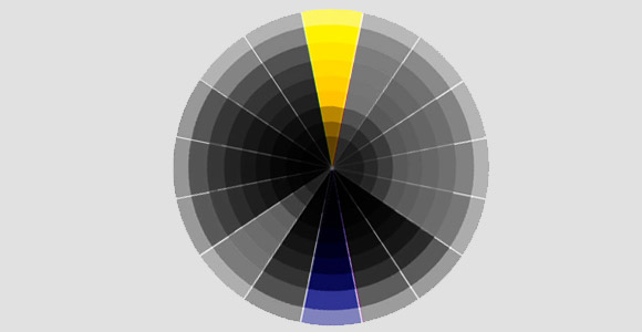
Complementary Color Wheel Example
Complimentary colors fall opposite to each other on the color wheel, such as Red and Green. This is probably the most common way to start a color theme. The name “complementary” is derived from the fact that these colors don’t relate to each other in any physical way, and thus naturally amplify each other. Many designers may use a base color, then apply the complement as the accent to really bring out the base.
Analogous colors
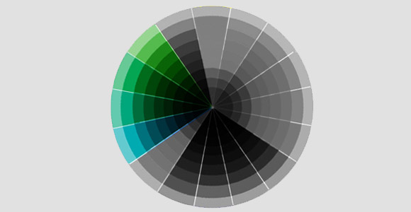
Analogous Color Wheel Example
These are colors that lie next to each other on the color wheel, like Yellow, Yellow-Green, and Green. They feel visually related because, well, they are! Harmonies that contain analogous colors tend to be less obtrusive and less of a contrast due to their likeness to each other.
Triadic colors
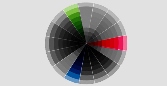
Triadic Color Wheel Example
Most often, 3 main colors are chosen for a color scheme (online, this tends to be black or grey, white, and a miscellaneous color). However, when these 3 colors are evenly spaced around the color wheel, they are considered “Triadic.” Opposite from analogous color harmonies, these harmonies tend to be quite high contrast and usually stand out among the other rules. The simple reason is because these harmonies contain colors which are least related to each other on the wheel. But this does not mean that they don’t look good together. Many themes that use triadic colors favor one or two of the colors as a base, then utilize the other color(s) as the accent(s).
RGB vs. Other Color Modes
While you probably already know about RGB color vs. CMYK and Pantone, it is important enough to briefly mention. Bottom line: RGB gives brighter, more vivid colors for display on monitors. CMYK and Pantone are best for printed materials.

Additive vs. Subtractive Colors
The reason why RGB colors work best on screens is because they are additive colors. They are based on the emission of light, such as what televisions and computer monitors do. With the additive color mode, the more colors you combine, the whiter the light becomes. Therefore, black in RGB is literally no color at all. White, on the other hand, is created with the maximum number of colors combined.
CMYK colors are based on the subtractive color model. Printers mix different amounts of CMYK (Cyan, Magenta, Yellow, and Key or Black) together to create individual shades of color. The more color that is added, the darker or more black the hue becomes. Pantone colors are a specific list of colors that a company, Pantone, created for print materials. You will only see the true version of Pantone colors if you view them in an official Pantone color book.
Color Conversion
 The problem that some designers run into is when they have to use a logo on a website and the colors used in the design are CMYK or Pantone. Yes, you can use the logo with the CMYK or Pantone color scheme, but it would look much brigher if uploaded to the web in RGB. This is why most companies pre-convert their brand colors. If your client gives you a brand guideline complete with the actual color numbers you need to use, then great! If not, try a color conversion tool online, such as this one from web.forret.com or this Pantone-CMYK-RGB conversion chart from Crigital Media.
Application Tips
Using the rules listed above, you should feel better prepared when selecting colors for the web. However, there are still lots of colors from which to choose when creating a website. Here are just a few more tips to help you even further in your color scheme creations:
- Use online resources: Adobe Kuler and Color Explorer offer tools to help designers create color schemes that fall within the color harmony rules.
- Select from the right color mode: Even Photoshop’s Color Picker tool has built-in features to assist those eager to make the best color choices for web design. Not only can you choose RGB colors, but you can also select from colors that the majority of monitors can display. Just check the “Only Web Colors” box in the Color Picker dialog window.
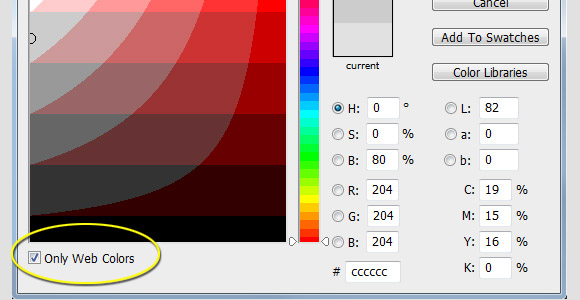
Adobe’s Photoshop has a built in “Web Safe” colors option in the color selector screen
- Embelish, don’t Distract: Remember that text should be always be readable. Color should never distract the viewer unless it is meant to direct their attention to a certain object.
- Use White Space: Even if the “white space” isn’t white, allow the eyes a place to rest. Bright colors and multiple colors in one place tend to be irritating in vast amounts.
- Check The Wheel: When you’re curious why 2 or 3 colors do (or don’t) look good together, check an RGB color wheel. Become acquainted with switching colors and get comfortable evaluating the relationship between various color combinations.
Once you’re familiar with the color wheel, you should be on your way to flawlessly integrating color into your designs. Don’t forget, when you create a color scheme that you absolutely love, save it so that you can use it for future projects!


